Plot arbitrary numeric values from topic message paths.
When playing back local or remote data files, this panel will preload the data belonging to the specified topic message paths for the whole playback timeline. Current playback time is indicated by a vertical gray bar.
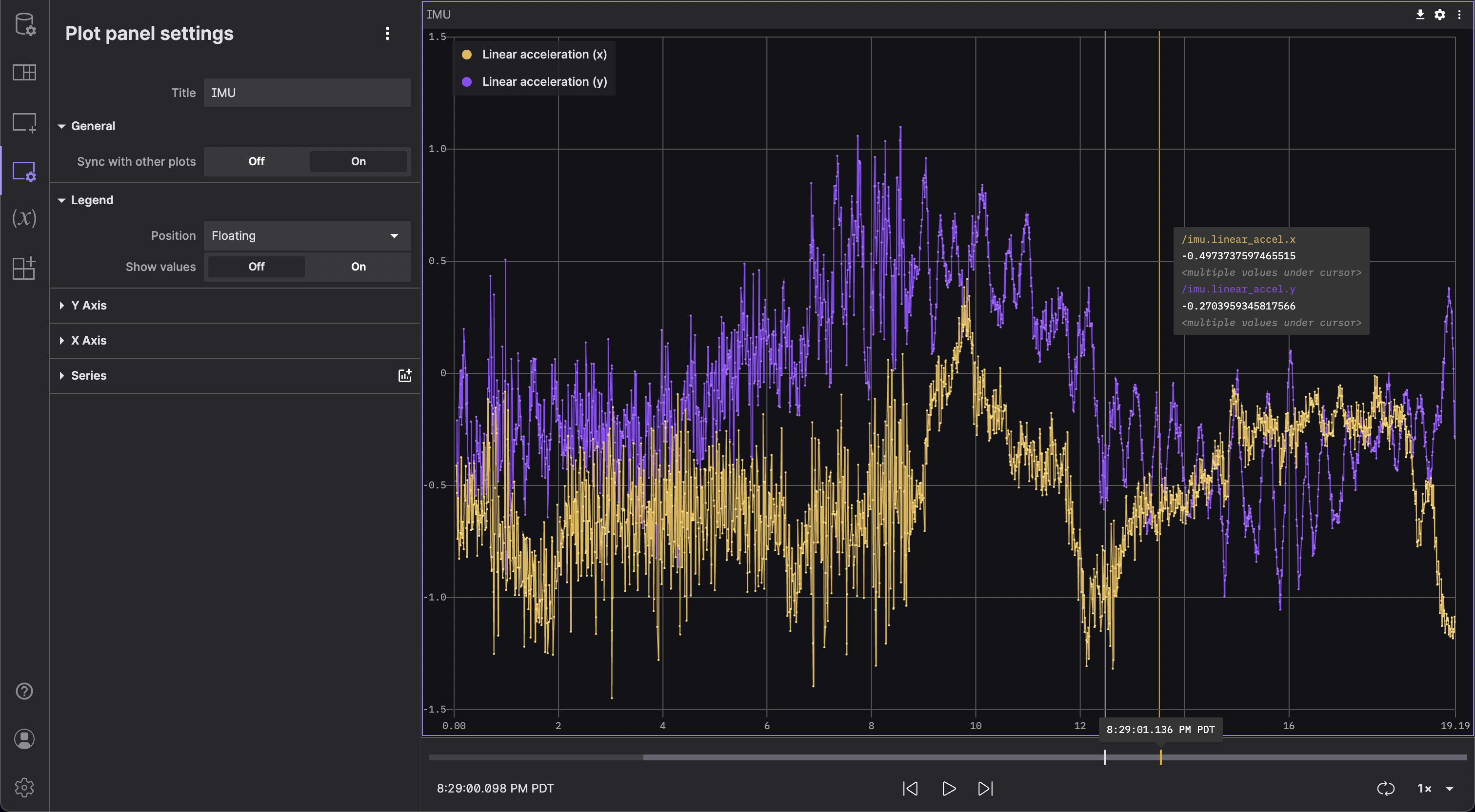
Settings
General
| field | description |
|---|---|
| Sync with other plots | Sync to other Plot panels with a timestamp-based x-axis |
| Legend | |
|---|---|
| Position | Position of the legend in relation to the chart (Floating, Left, Top) |
| Show legend | Display the legend |
| Show values | Show the corresponding y value next to each series in the legend (either at the current playback time or at a point on user hover) |
| Y Axis | |
|---|---|
| Show labels | Display label for the y-axis |
| Min | Fixed minimum value for y-axis |
| Max | Fixed maximum value for y-axis |
| X Axis | |
|---|---|
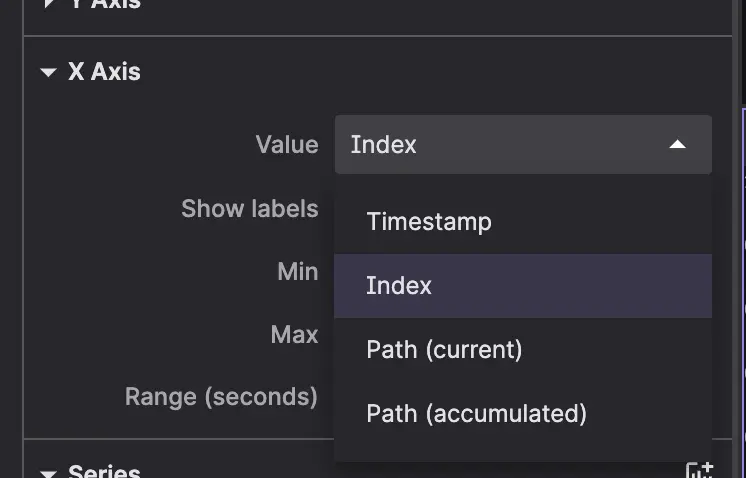
| Value | Value plotted on x-axis; a timestamp, an index or a message path |
| Show labels | Display label for the x-axis |
| Min | Fixed minimum value for x-axis |
| Max | Fixed maximum value for x-axis |
| Range (seconds) | Width of the panel viewport as it follows playback (in seconds); time series only |
| Series | |
|---|---|
| Message path | Message path containing Y values for the series |
| Label | Label displayed in the legend for the series |
| Color | Color used to plot the series |
| Line size | Width of line connecting data points |
| Show lines | Show line connecting data points. (Not applicable to reference lines.) |
| Timestamp | Timestamp used for message ordering. (Not applicable to reference lines.) |
User interactions
Use the "X" next to each data series in the plot legend to remove the series.
Use the panel settings to add, edit, or remove data series.
Y-Axis
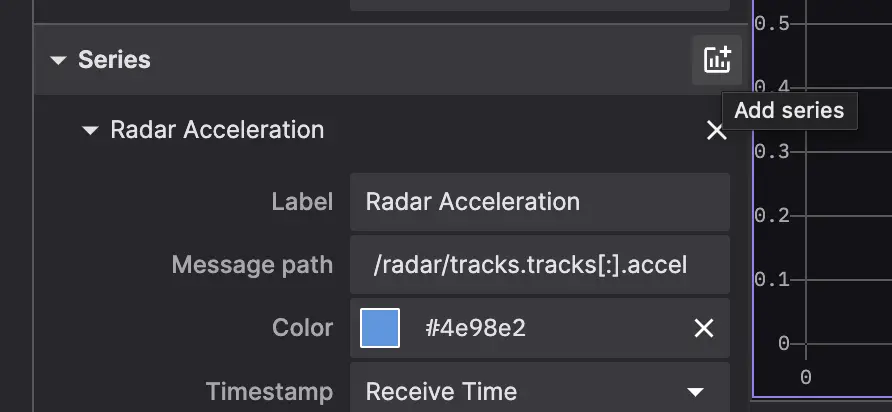
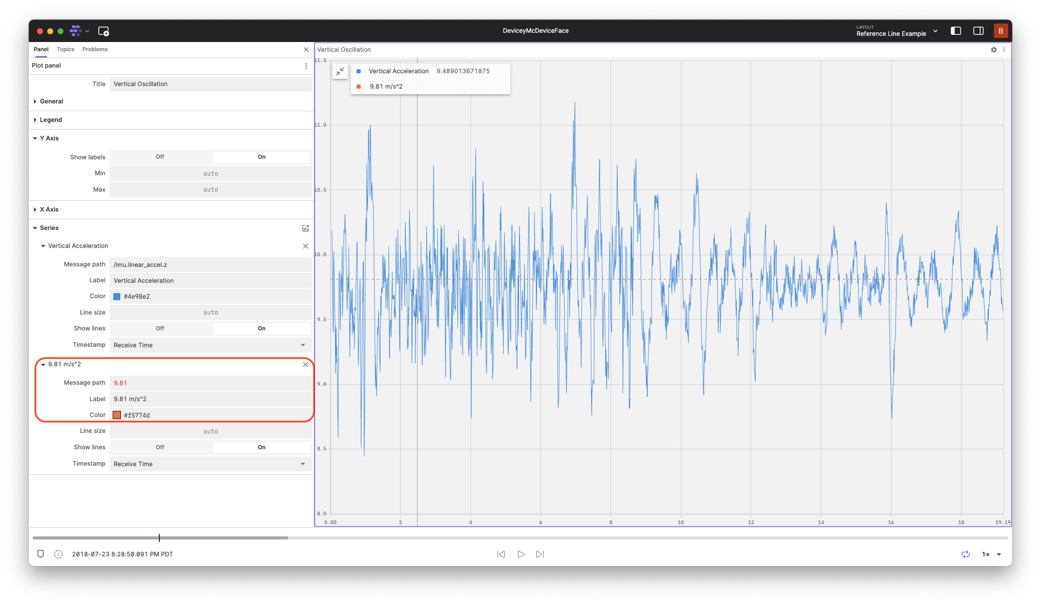
Enter the field or slice of data you would like plotted on the y-axis using message path syntax as a Series. Entering a single number will create a horizontal line at that value.
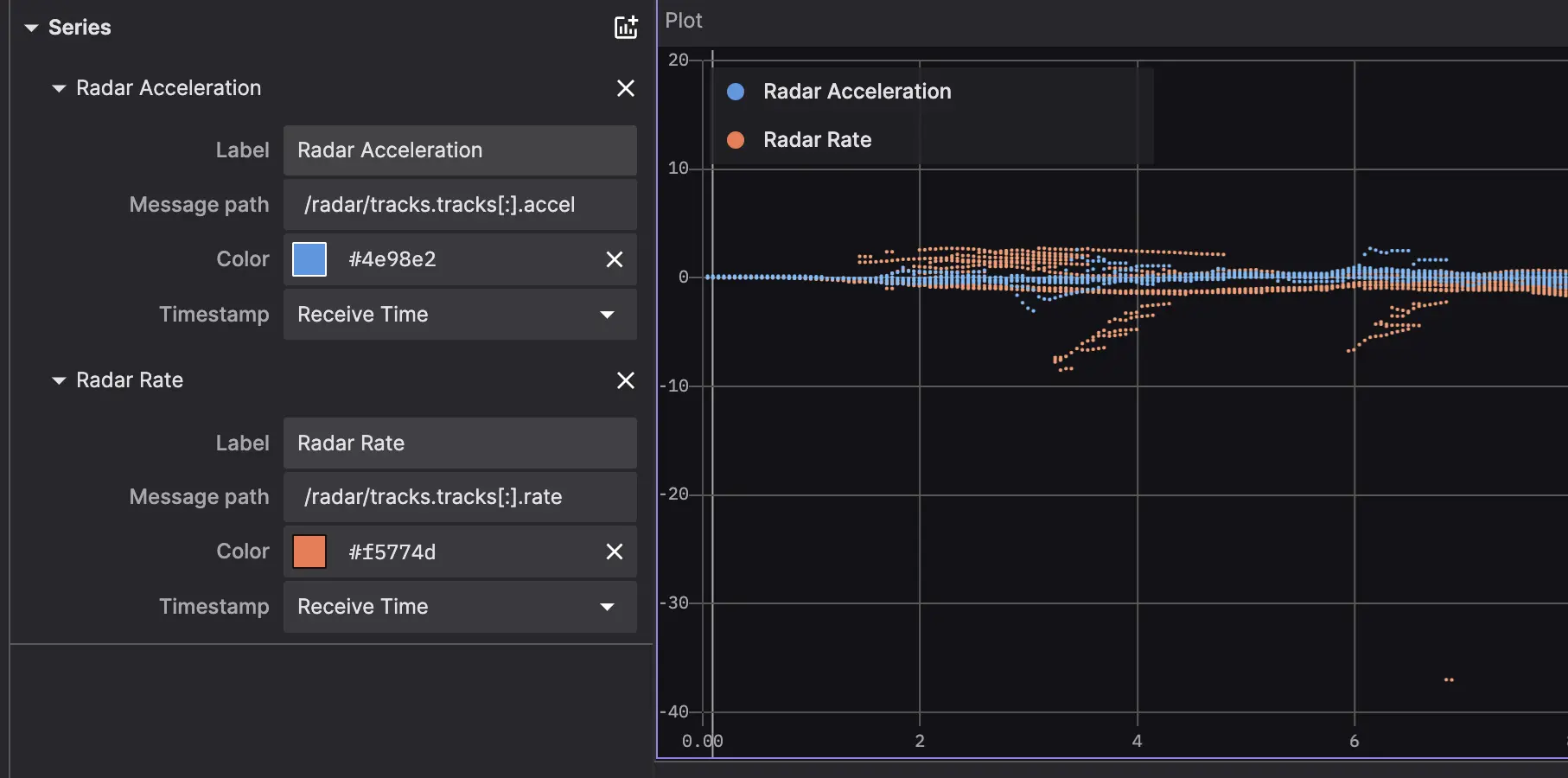
If you enter a message path that points to multiple values (e.g. /some_topic/some_array[:].x), the plot will display multiple values each x-axis tick.
Each series can be configured to display a descriptive label via the Label field in settings.
X-Axis
There are 3 possible values for the x-axis:
- Incoming message timestamp
- Y-axis value indices
- Data at a user-specified message path
All Plot panels with a time-based x-axis will automatically be synced with each other – when a user pans or zooms in one time-based Plot panel, all other time-based Plot panels will pan or zoom accordingly to maintain the same viewport.
Timestamp
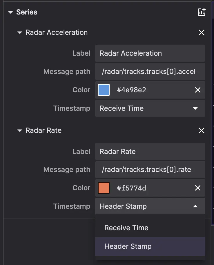
By default, the panel plots y-values against incoming messages' timestamp. It is possible to specify whether the timestamp is taken from a message's receive time or header stamp in each series' details menu. All Plot panels with timestamp x-axes in a given layout will be kept in sync for easy comparison.
Index
In this mode, adding message path /some_topic.some_array as a new line in the plot will chart that array's values against their respective indices. For example, if /some_topic.some_array contained the values [5, 10, 15], the resulting points on the chart would be [0, 5], [1, 10], and [2, 15].
This plots just the data from the latest tick, and should always point to an array of values.
Message path
Using message path syntax, specify the path to the x-axis data you want to plot, e.g. /some_topic.position.x. You can choose to plot data from just the most recent tick ("msg path (current)") or from all matching messages throughout playback ("msg path (accumulated)").
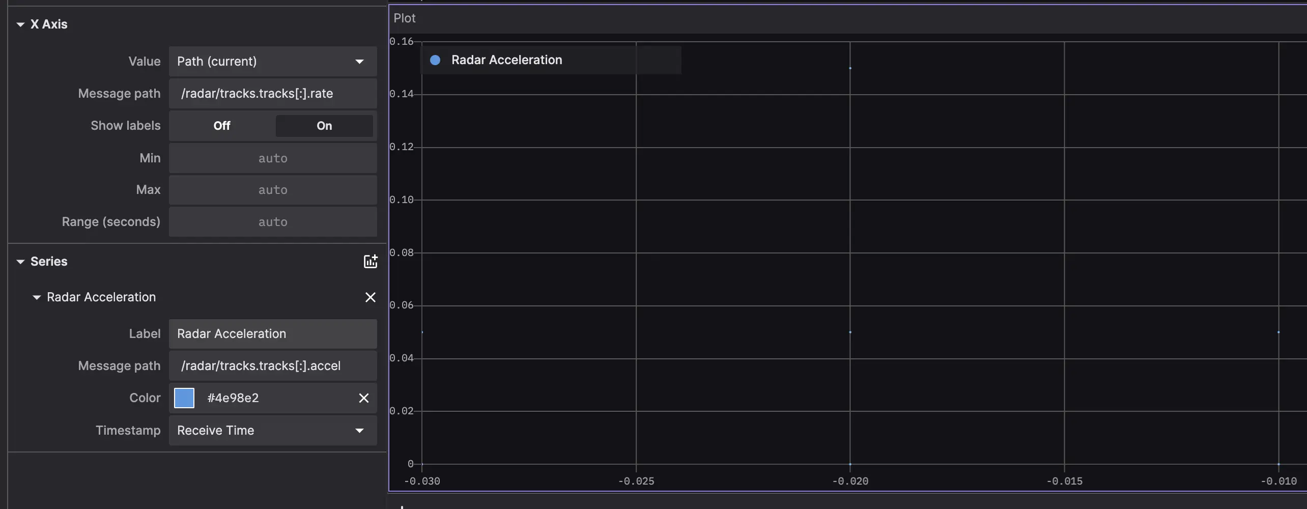
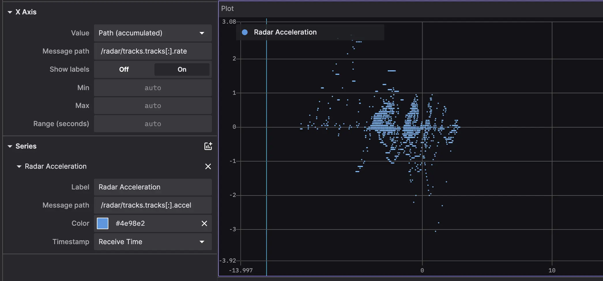
Click into the details menu for each data series in the legend to configure that series' line color and timestamp ordering method.
Scroll to zoom, and drag to pan. By default, scrolling will zoom horizontally only. To zoom vertically, hold v while scrolling. To zoom horizontally and vertically at the same time, hold b while scrolling. Click the "reset view" button or double-click the panel to reset to the original viewport.
Hover over any point on the plot to see its details in a tooltip. You'll see a vertical yellow bar appear, as well as a corresponding yellow marker at the same on the playback timeline. Click to seek playback to the yellow marker on the timeline.
Click the download icon in the top left to download the plotted data as a .csv file.
Math modifiers
The following Math functions are available to append to your Plot panel's message paths:
.@abs.@acos.@asin.@atan.@ceil.@cos.@derivative.@log.@log1p.@log2.@log10.@negative.@round.@sign.@sin.@sqrt.@tan.@trunc
Note that .@derivative will not work with scatter plots (i.e. message paths that point to an array of values for each x-axis tick).
See the Javascript Math documentation for more details.
Reference lines
To add a reference line at a constant value in a plot panel, add a series and set the message path to the constant value you would like plotted.
Shortcuts
- Scroll – Zoom in and out horizontally
v+ Scroll – Zoom in and out verticallyb+ Scroll – Zoom in and out both horizontally and vertically
